So we have acquired some skill in drawing the human figure. We understand anatomy, how to measure and use perspective. But why isn't our drawing leaping off the page? What is missing?
ある程度、人物を描けるようになったとしましょう。アナトミー、
Legendary comic artist Jack Kirby is often considered the ultimate master of dynamic figure drawing. Though he never trained formally, his figures always felt they were about to leap off the page and hit you in the face.
ダイナミックな人物画を描かせたら最高の巨匠とされているのは、
Jack Kirby called himself a cartoonist but some in the comics industry called him an impressionist and even a genius. His approach towards figure drawing is still used today in American comics, animation, movies and advertising.
カービーは自らを漫画家と称していましたが、
The above illustration of Marvel Comics' Black Panther (created by Jack Kirby) is crude but the dynamic power is undeniable. Some might say it's simply "forced perspective". That might be true, but Kirby really used this tool to push drama and power into his figures.
上のイラストは、マーベルコミックの「ブラック・パンサー」(
This would lead the path for more commercially trained artists like John Buscema. Buscema confessed he stole Kirby's compositions and sensibility in order to get that dynamic impact into his work when he was assigned to draw Marvel's Avengers or Fantastic Four. Kirby's tools combined with Buscema's draftsmanship would give results like this:
この流れは、ジョン・ビュセマをはじめとする、
And this!
こちらもそうです!
Comic professionals said Kirby's figures are so dynamic their arms and legs would be in two different time zones! Buscema used Kirby's method but in his own way.
コミック業界のプロフェッショナルたちは、
Ok, enough lauding over Kirby and Buscema. We know they are great -- HOW TO DO WE DO DYNAMIC DRAWING?
カービーとビュセマの素晴らしさは、お分かりのことでしょう。
Keys are:
ダイナミックなドローイングの秘訣を教えましょう。
Deep Space
Overlap
Size
Dynamic Rhythm
奥行き
オーバーラップ
サイズ
ダイナミックなリズム
Our magnificent and amazing model this month is the spectacular Utageguruma! Her uncanny body control and movement is almost spider-like at times. Perfect for this month's lesson point.
今月のモデルを務めるのは、
Take for example this first photo.
写真をご覧ください。
It's a great pose. Twists, angles, rhythm. And maybe in the hands of an average artist we might render a gesture drawing like this:
素晴らしいポーズですね。ひねり、角度、
So what's wrong here? Nothing, if the aim was just to illustrate a simple gesture. But see how even everything is. Everything seems to be on the same plane. There is nothing wrong with this approach, but for dynamic figure drawing, this is a "C" grade at best.
何がいけないかって? 単純なジェスチャーを描きたいだけなら、
Now look here. Now this is more dramatic. Here the contrast is undeniable. The exaggeration of the trust in her leg creates more impact. The use of contrasting size creates a sense of deep space. Rhythm is of course used to keep the eye moving.
こちらはどうでしょうか。ずっとドラマチックです。
Bear in mind these are only tools to help inform your work. How far you want to take it is up to you.
このようなテクニックは、作品に情報を与えてくれます。でも、
Mike Matessi, author of the FORCE books, has a great exercise using what he called the "Spatial Bounding Boxes". It's a fantastic tool to help you see and design your figure drawing and push depth.
See it used here in the previous Buscema example:
先ほどのビュセマの例に、
Obviously the use of a larger box and a smaller box to frame major elements of your figure helps you to see and push even deeper space into your drawing.
人物の重要な要素を大きいボックスと小さいボックスで囲むと、
Recently I am huge fan of the animated film, Spider-Man: Into the Spider-Verse. It's a fantastic film and it's filled with tons of super dynamic and inspirational poses that use the keys to dynamic figure drawing I noted above. See how Mike Matessi's "Bounding Boxes" can be applied here.
最近見た「スパイダーマン: スパイダーバース」は私のお気に入りになりました。

These are just great. Bold and dynamic!
文句なし。大胆で、ダイナミックです!
PRETASK
準備
Yes! Homework! Try doing your own dynamic drawing using the tools I noted above. Copy some of the images I posed above, or from my other suggested images below. Or you can go to Utagegurma's YouTube or Instagram page and try some figure drawings from there! Share your work with me here or on social media. Looking forward to seeing you at the next Ki Creative Drawing Workshop on April 15th! Have fun!
そうです! 宿題ですよ。説明したツールを使って、
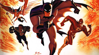
More examples of dynamic drawing for your artistic health!
ダイナミックなドローイングをいくつかお見せしましょう。
Jack Kirby
ジャック・カービー
John Buscema
ジョン・ビュセマ
Jack Kirby
ジャック・カービー
Bruce Timm
ブルース・ティム
Spider-Man: Into the Spider-Verse - Sony Animation
スパイダーマン:スパイダーバース


