February 1st from 1:00PM to 4:00PM , I will be giving figure drawing instruction at the Sokei Academy of Fine Art and Design! This figure drawing class is open to EVERYONE. Attendees range from students, illustrators, animators, instructors and even beginners. Please come and join me for a fun drawing session! Please see https://www.sokeiabroad.com/figuredrawing for details!
It was announced that Jules Feiffer passed away on January 17th 2025. His great career spanned over 70 years and he will be remembered for being one of America's most insightful cartoonists and satirists. He worked under legendary cartoonist Will Eisner, illustrated numerous literary works such as The Phantom Tollbooth, was a staff cartoonist for the Village Voice and was even a Hollywood screenwriter for Mike Nichols' Carnal Knowledge as well as Robert Altman's film adaptation of Popeye.
Feiffer had a great sense of cartoon design that conveyed much about a character with very simple and clear line. World renown drawing instructor, Glenn Vilppu has referred to Fieffer's use of line in his lectures on more than one occasion.
Feiffer's contribution to the American Civil Rights Movement of the 1960s truly deserves to be noted.
Feiffer was quoted in the August 25, 2014 issue of Comics Journal, "That [The Vietnam War] and the civil rights revolution were basically the two political acts that essentially defined my career as a political cartoonist.
Civil rights leader, and advisor to the Congress of Racial Equality, CORE, Bayard Rustin said the Jules Feiffer was a pioneer in defining the "white liberal".
In 1966 the Anti-Defamation League of B'nai B'rith published a collection of Feiffer's civil rights themed cartoons into a book titled, "Feiffer on Civil Rights". Inside Feiffer takes aim at not just the brutish ignorant white racist, but also the casually racist white liberal who also suffers from a type of ignorance. Blacks who wear their identity like a costume in order to be accepted, or blacks who use civil rights as a money hustle are also pointed out.
Feiffer, a self-proclaimed liberal, seemed to be capable of a very important quality: self-criticism and the ability to humorously point out his side's own hypocrisies. Not just pointing the finger at the ones you disagree with but also yourself. A trait that seems to be lacking in liberals today, as well as conservatives. This might be part of the reason for the current generations' hyper-reactivity to the slightest form of criticism.
"Civil rights used to be so much more tolerable before Negroes got into it." , a very insightful punchline from a Feiffer cartoon. Pointing one of the greatest stereotypical white liberal hypocrisies: Expressing moral vanity about blacks without ever having to actually live with them as your equal.
My mother Doris Funnye Innis, editor of the Congress of Racial Equality publication, Rights and Reviews corresponded with Jules Feiffer in 1966 and persuaded him to contribute one of his political cartoons to the civil rights organization. The cartoon satirized the sordid symbotic relationship between the Black Power movement and the forces of white supremacy. Like a destructive Yin and Yang, one always enabling the other.
Jules Feiffer was a not a good but a great white liberal in that, he expressed himself in his work earnestly as possible, pointed out the faults of those he felt opposed to without savagery, and being fully honest about where his side is falling short.
Feiffer roasted human nature itself. A fault in our character we all share.
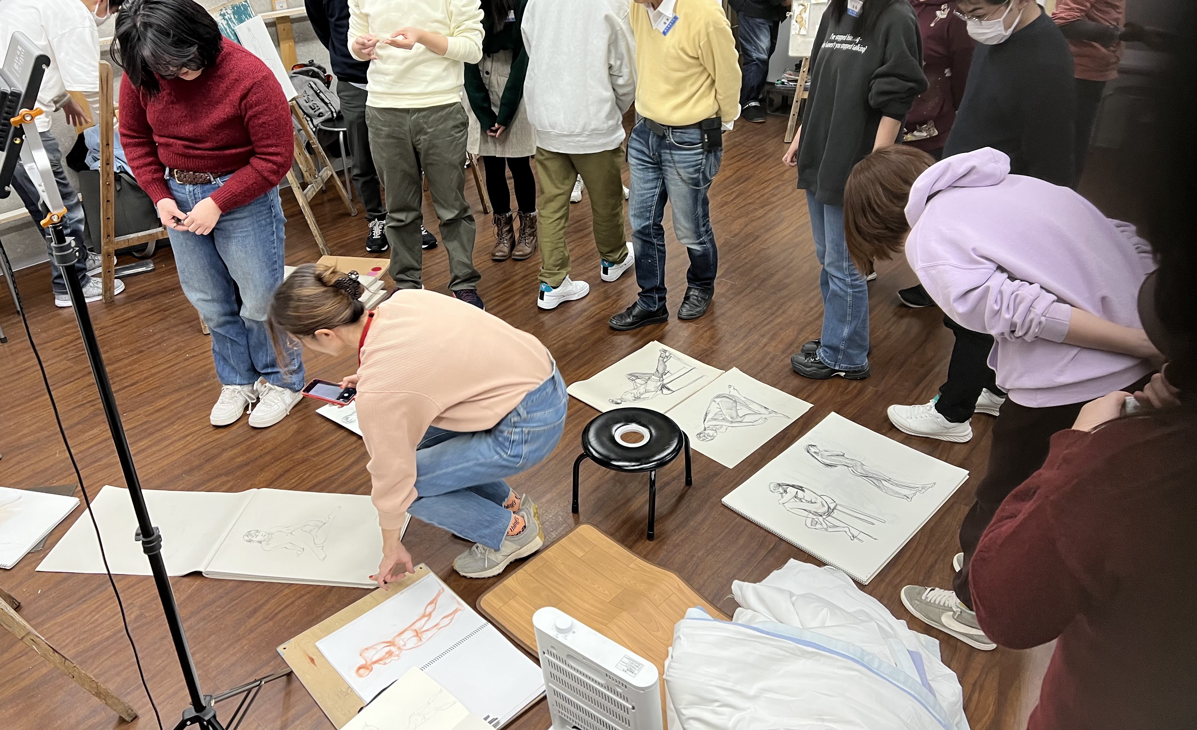
Saturday January 11th was the a great start for drawing in 2025. Ikebukuro Art School Croquis Class led by drawing instructor, Kayoko Tozawa held its first class for the year.
I joined in as a guest and help instructor.
1月11日土曜日は、2025年のドローイングの素晴らしいスタートでした。絵のインストラクターである戸沢佳代子が率いるいけぶくろ ART スクールのスケッチクラスは、今年最初のクラスを開催しました。
私はゲストとヘルプインストラクターとして参加しました。
Classes are held every other Saturday at the Sokei Academy of Art in Ikebukuro. The model was Ai Kumamoto who gave very cool gestural poses.
Tozawa sensei started the class with some basic, but very important drawing tips and suggestions. IE landmarks for drawing: the clavicle, the 10th rib, the pelvic bone.
*The diagram is from Graphics-sha's "Anatomy of Drawing Imagine FX"
*図はGraphics-shaの「Anatomy of Drawing Imagine FX」からのものです。
One of Tozawa sensei's other key points was the use of CSI lines when drawing. C curves, S curves and I lines. These lines give a sense of action, direction and rhythm in the figure.
This tool is somewhat similar to the "line of action" used in animation. But essentially it is a method of creating a sense of movement effectively in the figure.
Many students in Japan who look at my drawings often say "it looks like it has volume" or " it looks like it's moving".
Many people have heard about "squash and stretch" in drawing. Often people will show it in the bean or flour sack/ rice bag model.
Some people apply this in a very graphic way. Nothing wrong with that, but if people are interested in making their drawings look more believable, then weight should be considered in the volumes.
In animation there is the famous "bouncing ball" model to show squash and stretch as it applies to weight and time.
With weight we have two forces applied to the forms: "expansion" or "contraction".
If we had a piece of chewing gum on the floor. It just sits there because there are no aggressive forces acting on it. However if we push in it, the forces applied need to escape so the forces push the volumes outward as the gum expands.
Let's now imagine that the gum is now stuck to the floor and we want to pull it away. Since then gum is stuck and will not release from the floor part of it will stretch and thin out.
Volumes closer to the ground tend to spread out and expand, while things pulling away tend to thin out or seemingly contract inward.
How does this apply to drawing the figure?
When I draw a figure crouching on the ground, I tend to expand the muscles and draw them rounder as I imagine the center of gravity being heavier. My lines are slower and heavier as well.
However when I draw a dancer lifting upward, I imagine the dancer pulling away from gravity and my lines are faster and thinner.
Volumes affected by gravity will be drawn rounder and heavier. Lines that are resisting gravity will be thinner.
Imagine the forces of gravity working on everything you draw.
The first drawing class at IAS Croquis of 2025 will be on January 11th with the very cool model Ai Kumamoto! SeeIASクロッキー教室予約 for details and to reserve.
Classes will be held by art instructor: Kayoko Tozawa.
Ki Innis will be in attendance as a guest and support instructor.
I have covered this topic before in a previous post but it is worth revisiting.
以前の投稿でこのトピックを取り上げたことがありますが、再検討する価値があります。
When I was a beginner at figure drawing I was often stumped with where do I start? With the face? Many beginners start with the face because that is what we consciously connect with when we look at people.
Unfortunately the face is a very insignificant when understanding the body as a whole.
残念ながら、体全体を理解すると、顔は非常に重要ではありません。
The face reveals things such as the expressions in eyes, the mouth, whether the person young or old. But these are low priority compared to the figure itself. Is their body rigid? Slumped over? Is their weight heavy in their legs? Are they twisting or leaning? What are they doing with their hands? Are they about to run?
The gesture is what the person is actually doing. The gesture is the action, not the person.
ジェスチャーは、その人が実際にしていることです。ジェスチャーは行動であり、人ではありません。
Sometimes people set out to draw the person they think they see, and not what the person is doing. If you set out to draw what the person is doing, you probably will get closer to "who" the person actually is.
As the saying goes " We are not who we say we are. We are what we do."
My suggestion is to understand the gesture as a whole from head to toe. What is the biggest and broadest understanding of what the gesture is so we can avoid assembling it together piece by piece like Frankenstein's Monster.
Each line should work together in harmony with every other line as a complete whole.
When I put down random lines on a page like this, they are meaningless.
このようなページにランダムな行を置くと、それらは無意味です。
However when I put the lines in succession each one just a little different than the last, we automatically feel that they are not only related but connected to each other. And from this we have created a "harmony".
Where do we actually start? It doesn't matter if you start with the head or the torso. What matters is that you see the whole figure in your head before drawing. For the sake of making things easier in this example I will start with the center of the body. That way I can have an idea of how far I need to connect the legs to the floor in order to have the right proportions and feeling of weight.
After that I might place in the arms because that might aid showing what the figure is expressing. Later, I place in the head but in a gestural manner. The gesture of the head shows what the character is expressing or doing. Not the face.