Showing posts with label kiinnis. Show all posts

Saturday, August 25, 2018

Drawing the Female Form Part 1 -女性を女性らしく描く Part 1


The female form has been the subject of both art masters and students from the earliest days of design.
女性を女性らしく描くことは、デザインの歴史の初期から巨匠も、学生も取り組んできたテーマです。

My art instructor, Glenn Vilppu always suggested starting off our life drawing class sessions with a female form rather than a male. 
私の師匠、グレン・ビルプはいつでも、モデルを観察して描く勉強は、男性ではなく女性からはじめることを勧めています。

The female form is the perfect design to show flow, curves and rhythm and complementary forces.  This is not to say that the male form doesn't have curves but but they are more obvious to see the female form.
女性の姿とは、流れ、カーブ、リズム、対になるフォース(力)を素晴らしくよく見せてくれる、完璧なデザインです。もちろん、男性にもカーブはありますが、女性の方がずっとよく見えます。

Force and rhythm are at the root of all well executed figure drawings.  These relationships are flowing and water-like in design.  Perhaps due to the human body being mostly made of water. 
よくできた人物画には必ず、フォースとリズムがあります。フォースとリズムは、デザインを水のように流れていきます。おそらく、人間の体の大半が水でできていることに関係するのでしょう。

My rough sketches are just caricatures of the female form but I believe the relationships of flowing curves are constant in any female gesture drawing.  

私のラフスケッチは、女性の体のカリカチュアにすぎません。しかしいずれにしても、女性のジェスチャードローイングはすべて、関係性をもったカーブの流れによって形作られているものだと考えます。


Note the patterns of the flowing forces as I have noted before in previous blogs.
フォースの流れのパターンについては、前のブログでも書いているので、そちらもお読みください。


Drawing the female form can be very rewarding....who doesn't enjoy looking at a beautiful woman?
女性の姿は、描きがいがあります。女性の姿は美しく、観察するだけでも楽い気持ちになります。

" Learn how to draw a beautiful woman and you will never be poor." as the old saying goes.  
「美しい女性が描けるようになれば、金には困らない」とはよく言ったものです。

Please keep these tips in mind:

1) Draw long flowing lines.
2) Look for "S" Curves in the form.
3) Keep your lines round and soft like women naturally are. 

女性を女性らしく描くためのTIPS:
1)流れるような長い線で描く
2)フォームの中に「S」字カーブを探す
3)女性の特徴である、丸み、柔らかみのあるラインを使う。

Here are some suggested artists I feel were the best at depicting the female form: 
以下は、女性の「らしさ」をうまくとらえたアーティスト作品の例です。


Auguste Rodin  
オーギュスト・ロダン 


Edgar Degas
エドガー・ドガ


Alphonse Mucha
アルフォンス・ミュシャ


Fred Moore
フレッド・ムーア

John Pomeroy
ジョン・ポメロイ


Heinrich Kley
ハインリッヒ・クレイ


Pete Hawley
ピート・ホーリー


J. Scott Campbell
J・スコット・キャンベル


Adam Hughes
アダム・ヒューズ


Frank Frazetta
フランク・フラゼッタ


Friday, May 4, 2018

Draw FORCES Not FORMS.


In 1937 Don Graham,  one of the most instrumental teachers at the Disney studio somewhat criticized artists of drawing and animating FORMS instead of FORCES.   In contrast, he praised animator, Bill Tytla of being the only artist at the studio who consistently drew forces in his work.  

1937年のこと、ディズニースタジオでも最も優れた指導者のひとりドン・グレアム(Don Graham)は、「フォース」ではなく「フォーム」から描き、アニメーションするアーティストたちをたしなめていました。これと対照的に、作品に「フォース」を描くただ一人のアーティストだったビル・ティトラ(Bill Tytla)を称賛しました。

"...there is a constant use of graphic accents in his (Tytla's) manipulation (animation) , and these accents may be used as possible symbols of forces. The actual form is something which eventually is necessary but which is really a by-product of animation.  The vital element is force.  

「ティトラは、アニメーションにグラフィックアクセントを常に取り入れている。フォースのシンボルとして使用されているのだ。もちろん最終的にはフォームは必要になるのだが、アニメーションでは副次的だ。最も重要なのは、フォースだ。

What does this concept lead to. (?) As soon as the forces are under control, it is possible to create feelings or emotions or reactions in the audience."    - Don Graham 

このコンセプトは何を意味しているのだろうか? フォースをコントロールできるようになれば、鑑賞者の感じ方、感情、反応を自在に作り出せるのだ。-ドン・グレアム(Don Graham)


There is a saying, "The artist draws not the 'thing' but the forces that have created it."

「アーティストは、「物」ではなく、その根源にある「フォース」を描く」とはよく言われることです。

How many times have you been drawing and the form you have created seems to be dead and lifeless on arrival?  Proportions are correct, anatomy is correct, your choice of line is clean or clear but it is lifeless like a "paper doll cut-out".  

描いたものから生気が感じられない、と思った経験は数え切れないのではないでしょうか。プロポーションは正しく、アナトミーもおかしくはない。引いたラインはクリーンでクリア。ところが、まるで紙人形のように生気がない。


The cause might be because you failed to include the forces acting upon the subject.

その原因は、対象に働いている「フォース」を描いていないことです。

Forces are vital to creating a sense of life, energy and vitality in a drawing.  I believe capturing the forces are essential if you want your drawing to have a sense of movement.

ドローイングに生命感、エネルギ、躍動感をもたらしてくれるのが「フォース」です。動きを表現したいなら、フォースをとらえることが肝心だと思っています。

Some might dismiss this as "animation concepts" .  Truth is,  ALL drawing of the figure is a form of animation.    Movement, thoughts and feelings are all part of what we as artists are trying to convey to our audience.

これは「アニメーションの考え方だ」と見向きもしない人もいるでしょう。しかし、人物を描いた作品はすべて、アニメーションの一種だと考えることができます。動き、考え、感情はどれも、アーティストが鑑賞者に伝えたいことです。

The sketches below from the animator, Bill Tytla are good examples.  Please don't get distracted by the use of caricature.

ビル・ティトラ(Bill Tytla)による以下のスケッチは、このことをよく示しています。カリカチュアに惑わされないでください。


I used the red lines to indicate where the weight was either pushing in to or away from gravity.  Though the figures are not moving the sensation of movement exists.  If you ignored the facial expressions the sense of what they are feeling exist.  


内向き、外向きの力、重力に反発する力が働いているところに赤線を引いて示しています。キャラクターが動いているわけではなくとも、動きは伝わっています。顔の表情を見なくても、どんな感情を抱いているかは伝わってきます。


Glen Keane.

グレン・キーン

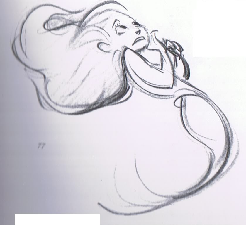
In Glen Keane's Little Mermaid, it's very easy to read in her flowing body what forces are working upon the character and even how she is feeling.

グレン・キーンによるリトル・マーメイドでは、まるで流体のような彼女の身体から、どのようなフォースがそこに働いているかが、容易に読み取れる。その時の彼女の感情も伝わってくる。

 1) Notice how your eyes "glide" around the character as opposed to falling to a dead stop.
 2) Notice how you feel the pushes and tension in her body.

1) 観る人の目は、キャラクターの周囲を滑らかに動く。どこかに行きついてとどまるようなことはない。

2) 押し込む力、引っ張る力が働いている部分を見ると、鑑賞者は何かを感じる。

These are the tools that create the feeling of life and real movement. Not the anatomy, not the cute faces.

これらは、鑑賞者に、生命や現実味のある動きを感じさせるためのツールです。アナトミーやかわいらしい顔では、生命や動きを感じさせることはできません。


Frank Frazetta.

フランク・フラゼッタ

Frazetta's works always have a sense of life and power behind them.  In his rough sketches it's really his shorthand that sells the pose.  We don't have to make super polished works to convey the energy and impact. 

フラゼッタの作品からは常に、生命感とパワーが感じられる。ラフスケッチを見ると、ポーズを魅力的に見せているのは、彼の簡略化された表現であることが分かる。エネルギーとインパクトを強めるためには、作品を入念に仕上げることが必要なわけではないのだ。


In this ruff sketch of an arm at the top we see simply an arm with it's anatomy.  But below we can see the graphic accents which show the relation of the forces in the arm.

このラフスケッチはどちらも腕だ。上は、アナトミーを意識した腕。下は、腕に働くフォースの関係性を表したグラフィックアクセントだ。

In terms of how this can relate to the human body we can see the how the forces push out defining the contours of the body.  

これを人体に関連付けて考えるには、人体の輪郭を外向きに押しているフォースに注目すると分かりやすい。


Below is an example of my sketching process of the graphic above. 

上に掲載したドローイングのプロセスを動画でご覧ください。


Tuesday, March 20, 2018

KI Creative Studio Drawing Workshop 1 Year Anniversary!

Thank you everyone!! Last night marked Ki Creative Studio's 1st Anniversary!  A YEAR has passed!  Over 12 drawing Tokyo workshops to offer people a chance to become better artists! Looking forward to another year!!  See you at the NEXT KI CREATIVE STUDIO WORKSHOP!!